Smart Watches, Pilots’ Associates, and Travelling Salesmen

I can probably be described as a wearable tech true believer. I bought in fairly early and have more or less stuck with it. As a device class it's still in the early stages, I think, but has a lot of potential. After all, humans have been putting computers on their wrists for a long time now (albeit ones which only compute the time).
My History with Smart Watches
I was an early backer of the original Pebble on Kickstarter. It looked (at the time) like everything I wanted out of a watch. It told the time, had a decent battery life, showed notifications from my phone, and could be extended with simple apps. I practice it was clunky as hell, and while the battery life of the watch itself was fine, it tended to half the battery life of the phone you connected it to. The latter issue was fixed eventually, though, and I generally found it really useful.
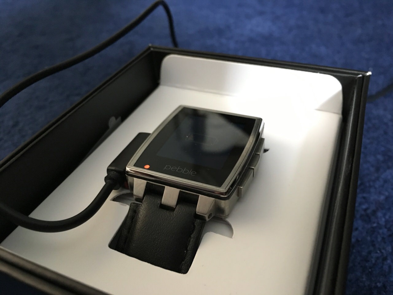
I "upgraded" to the Pebble Steel (amazon) when it was released. I still think it's a nice looking smart watch, if you can forgive the logo on the face. But other than looking less like it came out of a cereal box, it's pretty much the exact same watch as the original Pebble.
I backed Pebble again when they Kickstarted the Pebble Time. This was a pretty serious revamp of both the hardware and the software. The screen was now colour E-Paper (which is to say it had 64 colours), which gave the UI a lot of options which just weren't available in black and white. The updates software gave it a really interesting "timeline" based UI paradigm and a retro "glitchy" UI style which I still find very compelling.
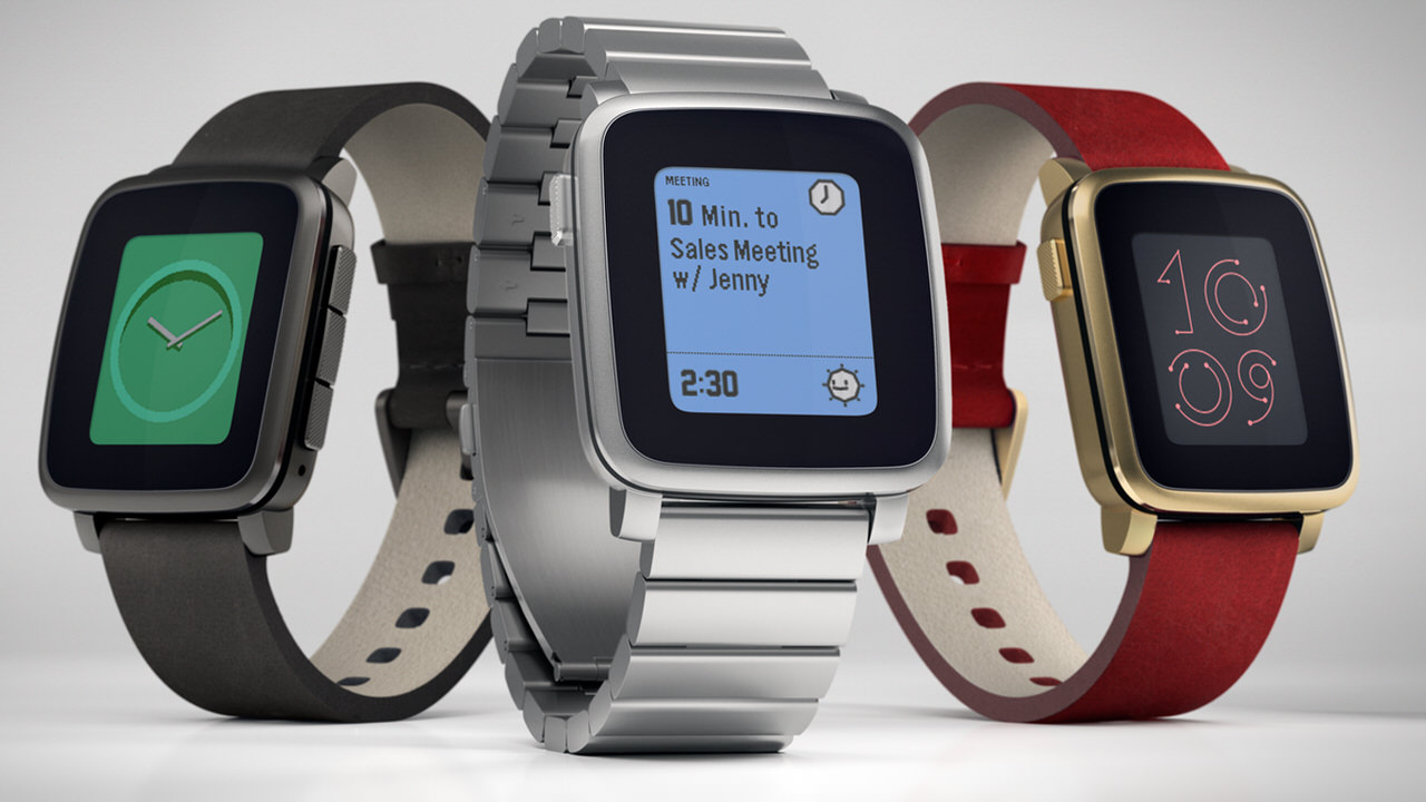
The Time had a pretty serious problem, though. One which wasn't entirely Pebble's fault. It shipped long after the Apple Watch. The Pebble Time's screen looked incredibly dull in comparison, and it couldn't match the Apple Watch's OS integration (on the iPhone, anyway).
Be that as it may, Pebble is now functionally dead. The watches still work as far as I'm aware, but there will be no further updates and sooner or later the smart connection will stop working completely.
The Apple Watch is basically the 500lb gorilla of the smart watch category at this point. In Apple terms it's a reasonable success, but one which doesn't compare to the iPhone. In watch terms it's an enormous smash. Apple is now the world's second biggest watch manufacturer by revenue. I'm not going to say too much about it here. The internet does not lack opinions of the Apple Watch. For me, it does the "smart" part really, really well, but has significant flaws overall.
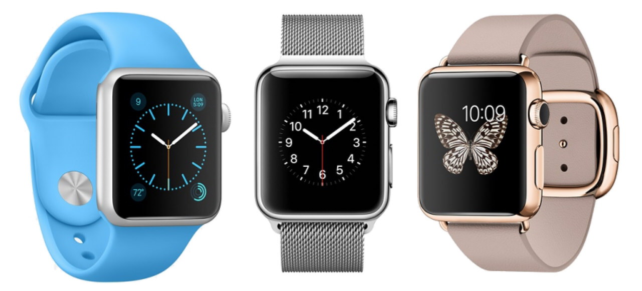
It's two biggest drawbacks are battery life (carrying extra chargers when travelling is really annoying) and the fact that you have to look at your wrist quite dramatically to trigger the screen. It is great at the smart part, but it fails in its role as a watch.
For a while I was testing out Android Wear, in the form of the second generation Moto 360 (amazon). Android Wear has the advantage of choice, as there are many manufacturers building hardware for it. As a result, you're more likely to find a watch which suits your aesthetic sensibilities. They're all a bit chunky for my taste, though. I also found Wear itself to have a fairly clunky interface. At the time the most attractive watch faces available looked significantly worse (to my eyes) than the ugliest available on the Apple Watch. It also took me days to figure out how to stop "OK Google…" appearing on the face[1]. This was a while ago, so has probably gotten better.
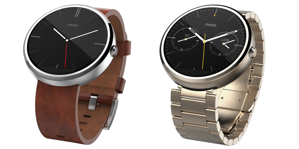
I also can't really blame Android Wear for having worse iPhone integration than the Apple Watch. That's an unfair comparison. The Apple watch doesn't integrate with Android at all, after all. If you're an Android user, Wear is the way to go for a true smartwatch.
At this point I'd started to get frustrated with the poor battery life and general clunkiness of true smart watches, so decided to try a hybrid approach. I'd admired the Withings Activité (amazon) for some time, but had previously been put off by the price. It probably doesn't really count as smart, given that the only thing it adds to a regular analogue watch is step tracking. But still, it's gorgeous and the battery lasts about a year. Withings has now been acquired by Nokia, and the original activité is no longer visible on their website, which I think is a shame.
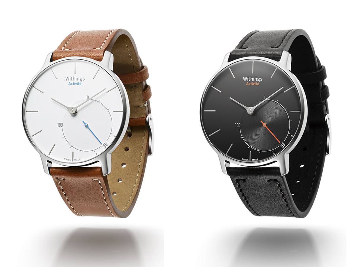
Digression: I briefly put my Activité down in the gym and some bastard walked off with it. I'm still really pissed off about that. If that hadn't happened, I'd probably still be waring it.
Shortly after that happened, Withings released the Activité Steel HR (amazon), so I picked one up as a replacement. The Steel HR adds a heart rate sensor and a small screen on the watch face which can show notifications, your step count, the date, etc. What it takes away is battery life (it needs charging every couple of weeks) and general attractiveness. The layout of the face isn't as nice as the activité, and glass looks noticeably worse in person than sapphire crystal on the face cover.
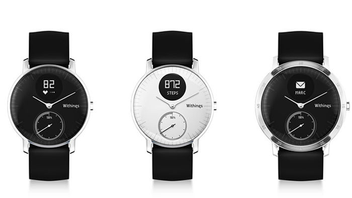
In my opinion it strikes a pretty good balance of looks, features and battery life. What it also seems to have, though, is a significant design flaw, at least in some units. Condensation built up inside my watch, and would fog the face whenever the temperature changed. It didn't even need to be a large change to trigger it. It still worked fine, but it looked awful.
Withings sent me a replacement, but I was a little put off, so sold it and went looking for an alternative.
In terms of functionality, the Skagen Hybrid Jorn (amazon) sits somewhere between the Activité and the Steel HR. It runs off a coin cell battery, so lasts around a year. It also reports its current battery level to iOS, which displays it in the "Batteries" widget. It lacks a heart rate monitor, but can do just about everything else the Steal HR can.
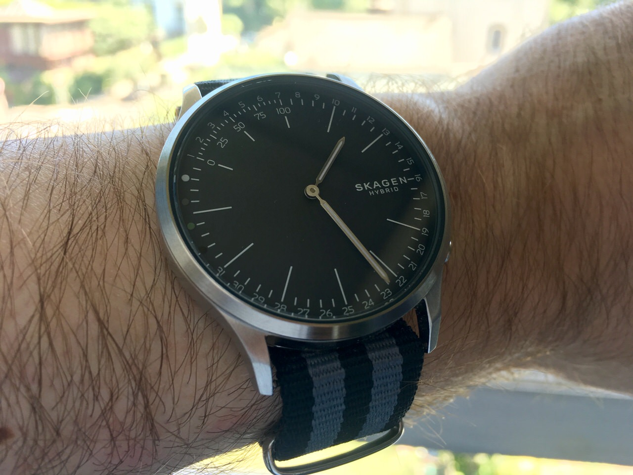
Its face is at once simpler and more complex. There are no additional complications. No dials or tiny screens. Instead the Jorn shows extra information around the outside of the main dial. The numbers 1 to 31 for indicating the date, 0% to 100% for your daily step count, and four coloured dots which can be programmed to represent notifications from specific apps or contacts. When triggered to do so, the watch's main hands point at the appropriate number or colour for a few seconds, then return to displaying the current time. Admitted this is much less clear than text on a screen. It has a certain "What's that Skippy?" feel to it.
It has three buttons. These can be programmed to show data on the watch itself: step count, current date, and alternative time zone are options. But also to control your smart phone. They can trigger the camera, or control music playback.
It's not as attractive as the Activité. It lacks its elegance and pleasingly curved glass (which also serves to prevent reflection), but I find it more attractive than the busier and cheaper looking Steel HR. All in all I'm very happy with it.
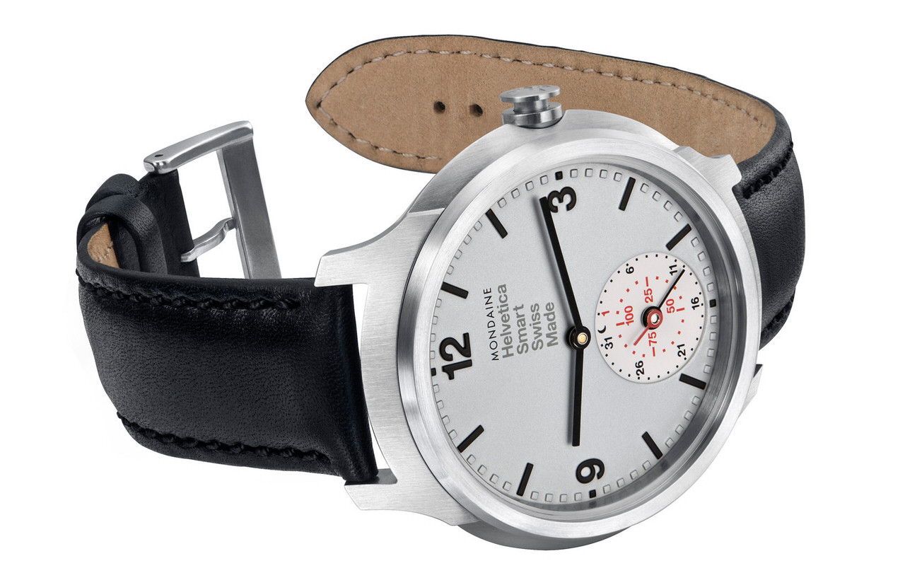
I do find myself looking wistfully at the Mondaine Helvetica Smart (amazon), which I think is absolutely gorgeous. It's much more expensive than the Skagen, though (go figure) and lacks the three assignable buttons, which I definitely think I'd miss.
(Hopefully) My Future with Smart Watches
The pilots associate is something I came across during the early research for my PhD. The gist is of it is this: it takes over the screens in a fighter jet or helicopter and tries to show the pilot contextually appropriate information. Are they getting low on fuel? It shows directions to the closest refuelling stop. Approaching an airport? It shows the correct landing procedure. Playing volleyball? It advises them to remove their shirt[2]. You can find links to the relevant papers here, if you’re interested.
Generally, it worked. Sometimes it made mistakes. It turned out that the mistakes are okay, so long as it’s right the majority of the time. Importantly, it can be corrected when it gets it wrong. Probably just as importantly, it doesn’t pretend to be too smart. It doesn’t pretend to be a person, which is one of the issues with conversational interfaces (like Siri and Alexa). They act like a person, so users are unforgiving of what would be dumb mistakes if a person made them.
But I digress. What is the relevance of the pilots associate to smart watches? Honestly, I think it’s the future of the category. Done right, I think it could be a game changer. Smart watches could go from being toys to having genuine utility.
Let's consider a simple use case. A few Saturdays ago I left the flat to complete the errands on my todo list (I use Things 3, for the record). I needed to go and get measured for the suit I'll be wearing at a friend's wedding, I needed to go take a look at a piece of audio visual equipment ("need" might be a fairly relative term here), and I had a small list of groceries to pick up.
I manually sorted them into a sensible order. The suit first because it's important, the groceries last because I don't want to be carrying them on the other errands. Then I opened Google maps to plan my route to the first. From their I planned my route to the second, and so on. That's pretty straight forward, but if I had 10 things to do it's likely to get more complicated. I'd probably use a wonky rule of thumb to choose what order to do them in, and end up wasting a bunch of time. I'd also have to faff with my phone a lot in public, which is something I try to avoid.
How would a pilot's associate on my wrist make that easier? When I was about the leave the house I could tell it that I was on my way to run errands. It could look through my todo list for anything tagged with @errand and run a quick travelling salesman type algorithm to sort them into a sensible order. It should give me the option to approve this order and then learn from any changes I make. Then it would show me the directions to the first errand. When I've gotten measured for my suit I could tap the screen to complete the task or maybe just say: "Hey Siri, what's next?"
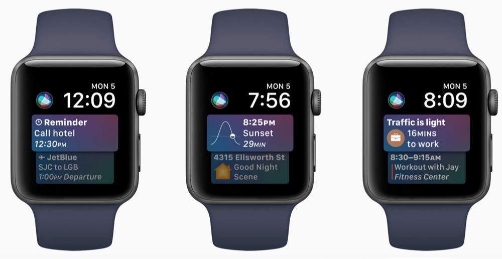
Speaking of Siri, Apple seems to be taking a step down this road with introduction of the Siri Watch face in version 4 of Watch OS. It looks like a very small step to me, though. The onus is still very much on you to sort things into the right order. The travelling salesman part is missing, but hopefully that's coming later.
If the battery life goes back up as well, I might just go back to a full smartwatch when that time comes.
Perhaps you're thinking that this is called a "Smart Assistant", but come on: doesn't "Pilot's Associate" sound much cooler?
