Material Design and iOS


Disclaimer: the opinions expressed herein are my own, not those of my employer, and that’s what this post is: opinions.
One of the complaints about Google’s iOS apps is that they look like Android Apps. Somewhat obligingly, Jason Snell recently published an article along these lines over at MacWorld (I picked this up via Daring Fireball, where John Gruber is also a big fan of this line of thinking). That’s generally what the complainants say, but not (in my opinion) what they mean. What they mean is that the apps follow Google’s Material Design guidelines (though these articles often confuse the two), and (again, in my opinion) is not the same thing at all.
I’m going to say that word again, just to be sure: Opinion. Please bare that in mind. That said: I’ve been an iPhone user since the original iPhone, and now I work at Google… as an iOS developer. I think my opinion should carry at least a little weight here.
The article linked above is extremely hung up on Google’s iOS Apps looking like the equivalent apps on Android. It makes the assumption that this, ipso facto, is a bad thing, but never really backs that up with anything concrete. Here it is, taken directly from the article:
I don’t know the reason–arrogance, pride, or a lack of desire to do the extra work are all options–but for a while now, Google has insisted on using the Material Design approach when creating iOS apps. Just as Word 6 inflicted Windows conventions on Mac users, Google’s iOS apps inflict Android on iOS users.
I think that assumption is very wrong for one simple reason: The important distinction between iOS and Android is not how it looks, but how it moves and how it feels[1]. I’m not going to speak for all of Google’s iOS apps, but the ones I work on (being Google Calendar iOS and AdSense for iPhone) definitely move and feel like iOS. The teams put a hell of a lot of work into that, and I’m borderline obsessed with it.
Let’s table that for now though, and actually talk about some of the ways in which Material Design and Apple’s own design language differ. One thing worth noting here is than Material Design has a very comprehensive spec, where as Apple’s design language is mostly available via inference and example. It discussed to some extent in the Human Interface Guidelines, but mostly defined in two place:
- Apples’s own apps;
- The default appearance of the iOS UI components.
So when I say “Apple’s Design Language” below, this is what I’m generally referring to. The be clear, that not necessarily a knock against it. Apple doesn’t need to publish copious descriptions here; it only expects this design language to be used on iOS, and they already went ahead and implemented it. Google, on the other hand, intends for Material Design to be used anywhere and everywhere.
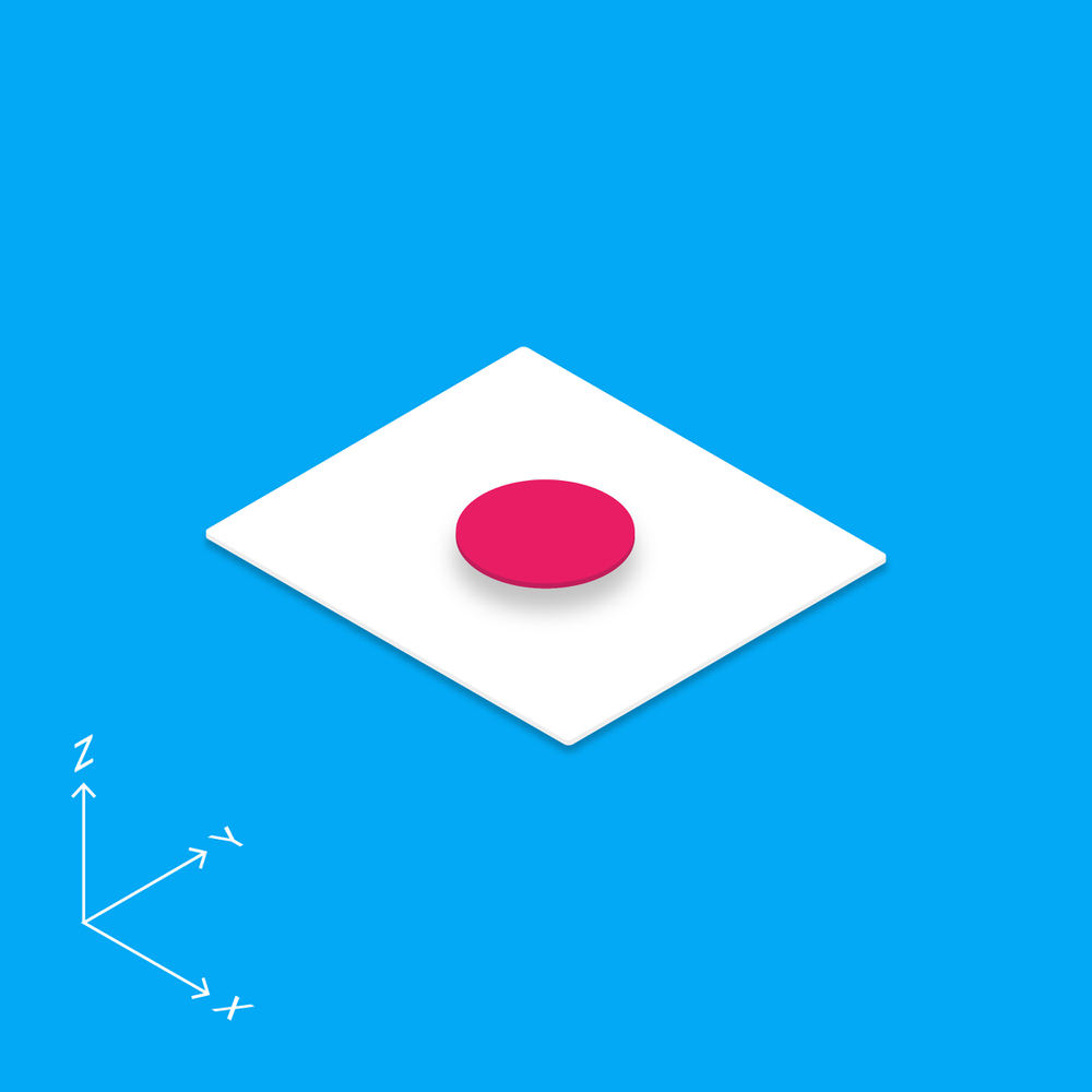
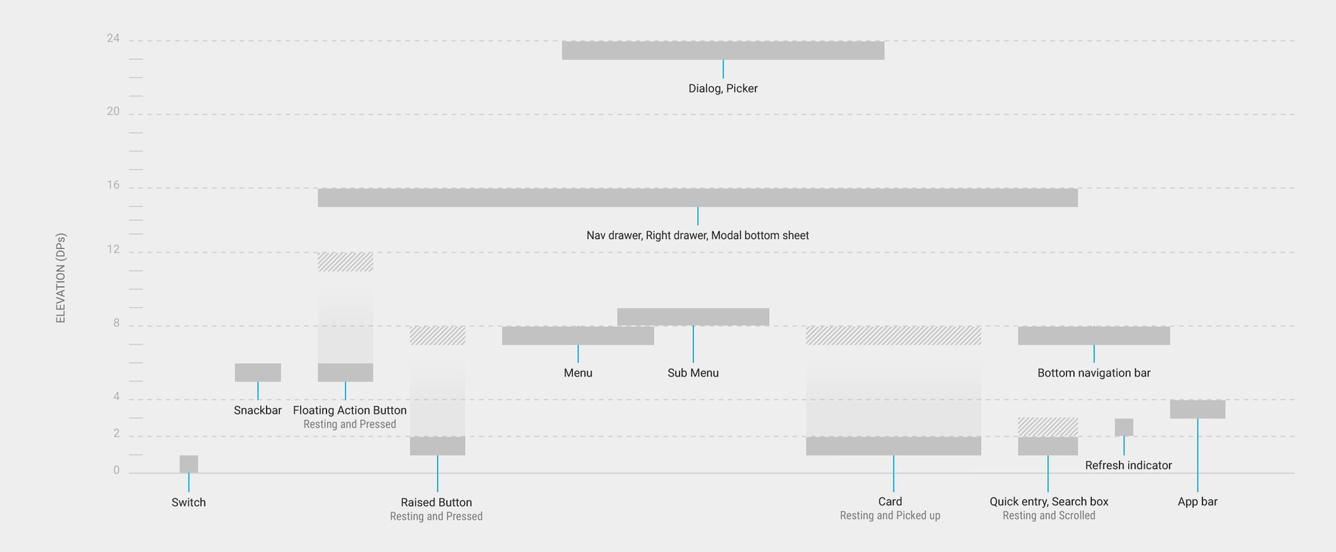
Material design is very keen on differentiating screen elements as being based on layers and depth. It proscribes consistent and specific “heights” (see the image below) for different on screen elements, and uses drop shadows to demonstrate them. iOS’s default design language also uses layers and drop shadows (look here and scroll down to “Use depth to communicate”), but in a much more ad hoc way.
Apple’s design language uses uses transparency to indicate layering, where is Material Design tends away from it. One example of this is headers. By default, Apple’s headers are transparent, or at least translucent, and the content underneath shines through. Material design, on the other hand, likes the headers (which it calls “app bars”) to be opaque and colourful. It’s also like the header to be very tall by default, and to shrink and “lift up” as the content passes beneath it.
Material Design has it’s own iconography, which is used throughout Google’s iOS apps, but whenever iOS has its own distinctive icon, a Material Design version of it is used. The share icon is the poster child for this. Weirdly Snell complains about Google’s use of non-standard icons, congratulates Apple for using Android’s standard icons in Apple Music for Android… and then admits:
…I have noticed a disappearance of the Android share icon (a blob growing into two blobs) and the reappearance of the iOS share icon (an arrow leaving a box) throughout Google’s iOS apps.
On the other hand, Material Design is big fan of the “hamburger icon”, which triggers a menu in a sidebar (also noted in the article). I’ve never seen an Apple made app which uses it, but it’s pretty common in third party apps.
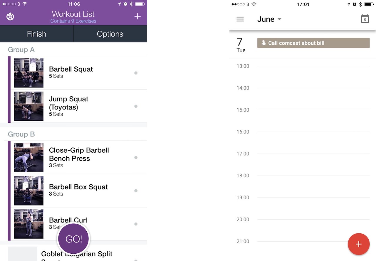
Whenever a particular action is to be promoted, Material Design suggests the use of a “Floating Action Button”. Snell calls this out specifically:
To create a new document, you must tap a large red circle at the bottom right corner of the screen.
In so far as I’m aware, Apple’s design language doesn’t have anything similar. Even so, it’s used in a bunch of non-Google iOS apps, the first of which which comes to mind is Fitocracy (pictured on the left below), and actually predates the Material Design Spec.
One last thing. Animations, which are kind of my wheelhouse. If you saw an animation in Google Calendar for iOS, chances are I implemented it. iOS has always used easing curves for animations, so an item will start moving slowly, accelerate up to the mid point, and then decelerate to a stop. Otherwise, your animation is going to look very unnatural.
Material design also uses easing curves, but suggests they be asymmetric. Rather than try and explain this myself, here’s the relevant part of the spec. Personally: I love this. I agree with the spec. It has a lot more personality.
Let’s circle back around to Snell’s original complaint: That Google is making the same mistake now that Microsoft made in the 90s when they shipped versions of their apps for the Mac which looked and felt like the apps they shipped for windows. UI wise the Mac is way more consistent than iOS, with almost all 3rd party apps using the default widgets and style (and Apple themselves actually often being the ones who break those rules).
But that fact that Microsoft Word for Mac didn’t look like it belonged on the platform wasn’t the problem. That was a problem, mind, because it looked like crap. But that it neither felt nor moved like it belonged on the platform was ten times worse.
So, in conclusion: Material Design is not “The Android Design Language”, it’s a design language created and published by Google. Android uses it as standard, because Google eats its own dogfood here. It does not, however, adhere to it exactly. It’s also used by Google for the Web, and yes, with appropriate modifications Google uses it for iOS apps.
It’s not an exact match for Apple’s own design language, but fits into the platform very nicely. When done right, it moves and feels great, and those two things are what I expect from my iOS apps.
It’s also wrong for another reason: Does Snell really think that using Material Design on iOS is less work? ↩︎